| name | iblai-vibe-workflow |
| description | Add workflow builder components to your Next.js app |
| globs | null |
| alwaysApply | false |
/iblai-vibe-workflow
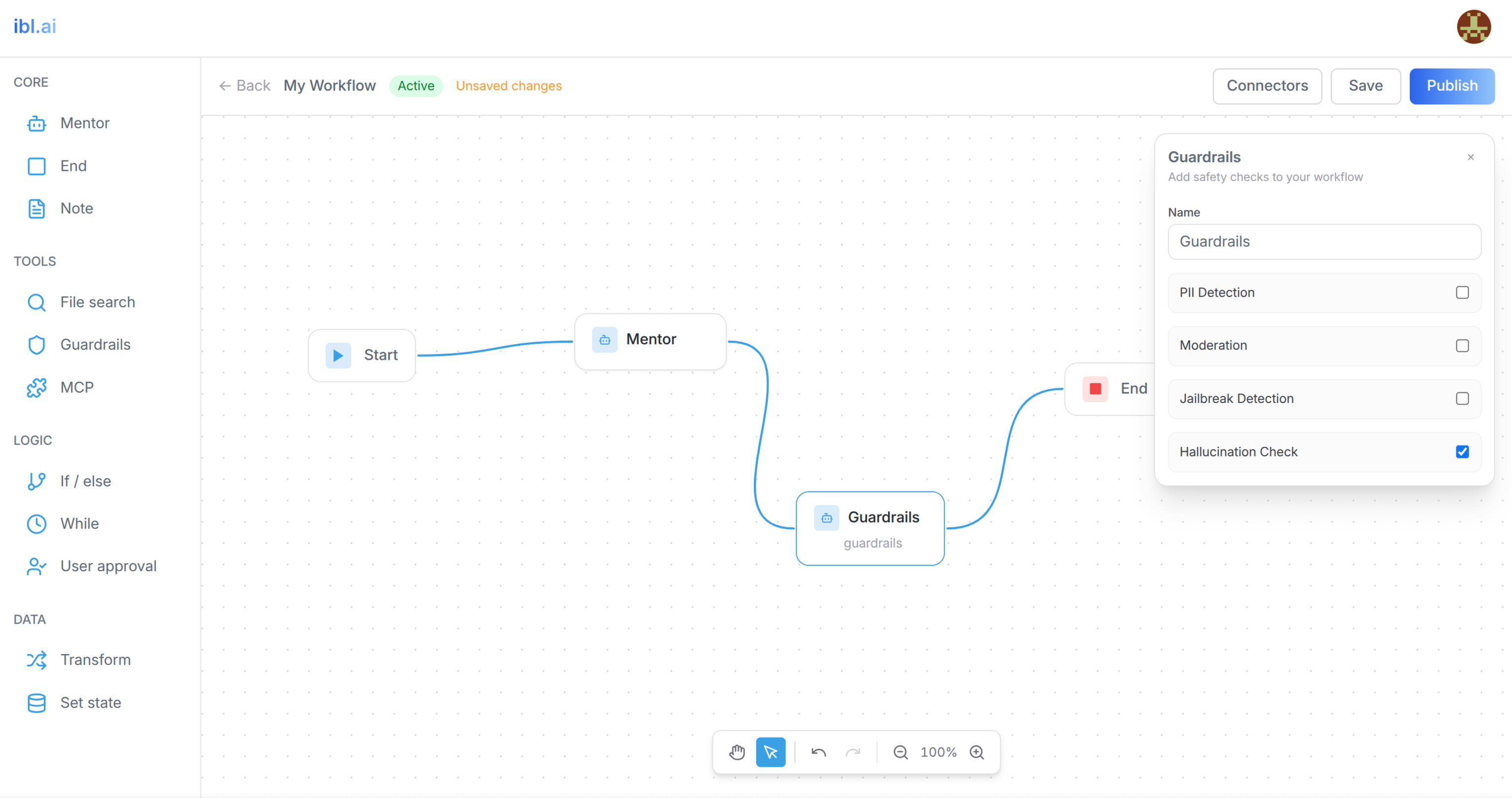
Add AI workflow builder features -- a visual workflow editor with a node type
browser sidebar, node configuration panels, connector management, and
create/delete workflow modals. Includes a custom canvas with drag-and-drop,
bezier curve edges, pan/zoom, undo/redo, and auto-save.
Do NOT add custom styles, colors, or CSS overrides to ibl.ai SDK components.
They ship with their own styling. Keep the components as-is.
Do NOT implement dark mode unless the user explicitly asks for it.
When building custom UI around SDK components, use the ibl.ai brand:
- Primary:
#0058cc, Gradient: linear-gradient(135deg, #00b0ef, #0058cc)
- Button:
bg-gradient-to-r from-[#2563EB] to-[#93C5FD] text-white
- Font: System sans-serif stack, Style: shadcn/ui new-york variant
- Follow the component hierarchy: use ibl.ai SDK components
(
@iblai/iblai-js) first, then shadcn/ui for everything else
(npx shadcn@latest add <component>). Do NOT write custom components
when an ibl.ai or shadcn equivalent exists. Both share the same
Tailwind theme and render in ibl.ai brand colors automatically.
- Follow BRAND.md for
colors, typography, spacing, and component styles.
You MUST run /iblai-vibe-ops-test before telling the user the work is ready.
After all work is complete, start a dev server (pnpm dev) so the user
can see the result at http://localhost:3000.
iblai.env is NOT a .env.local replacement — it only holds the 3
shorthand variables (DOMAIN, PLATFORM, TOKEN). Next.js still reads
its runtime env vars from .env.local.
Use pnpm as the default package manager. Fall back to npm if pnpm
is not installed. The generated app should live in the current directory,
not in a subdirectory.
Common setup (brand, conventions, env files, verification): see docs/skill-setup.md.
Prerequisites
- Auth must be set up first (
/iblai-vibe-auth)
- MCP server + skills configured (
@iblai/mcp in .mcp.json)
Step 1: Check Environment
Before proceeding, check for a iblai.env
in the project root. Look for PLATFORM, DOMAIN, and TOKEN variables.
If the file does not exist or is missing these variables, tell the user:
"You need an iblai.env with your platform configuration. Download the
template and fill in your values:
curl -o iblai.env https://raw.githubusercontent.com/iblai/vibe/refs/heads/main/iblai.env"
Architecture
The workflow feature has two pages and three custom components:
app/(app)/workflows/
├── page.tsx                          # List page (grid of workflows)
└── [id]/page.tsx                     # Editor page (sidebar + canvas)

components/workflows/
├── types.ts                          # Shared types (CanvasNode, CanvasEdge, NodeConfig)
├── workflow-canvas.tsx               # Custom canvas with SVG edges, pan/zoom, undo/redo
└── node-config-panel.tsx             # Context-aware node property editor
Step 2: SDK Components
Import SDK components directly -- there is no CLI generator:
import {
WorkflowSidebar,
ConnectorManagementDialog,
CreateWorkflowModal,
DeleteWorkflowModal,
} from "@iblai/iblai-js/web-containers";
import {
useGetWorkflowsQuery,
useGetWorkflowQuery,
useCreateWorkflowMutation,
useDeleteWorkflowMutation,
usePatchWorkflowMutation,
usePublishWorkflowMutation,
useValidateWorkflowMutation,
workflowsApiSlice,
} from "@iblai/iblai-js/data-layer";
Step 3: Register workflowsApiSlice in Redux Store
CRITICAL: Add workflowsApiSlice to the store in store/iblai-store.ts:
import {
  coreApiSlice,
  mentorReducer,
  mentorMiddleware,
  workflowsApiSlice,
} from "@iblai/iblai-js/data-layer";

export const store = configureStore({
  reducer: {
    [coreApiSlice.reducerPath]: coreApiSlice.reducer,
    [workflowsApiSlice.reducerPath]: workflowsApiSlice.reducer,
    mentor: mentorReducer,
  },
  middleware: (getDefaultMiddleware) =>
    getDefaultMiddleware()
      .concat(coreApiSlice.middleware)
      .concat(workflowsApiSlice.middleware)
      .concat(mentorMiddleware),
});
Without this, all workflow API hooks will silently return undefined.
SDK Component Props (VERIFIED)
IMPORTANT: The prop names below are the ACTUAL props accepted by
the SDK. The skill docs in older versions had incorrect prop names.
Do NOT use isOpen, onClose, org, or onCreate -- they will fail.
<WorkflowSidebar>
Node type browser sidebar. Does NOT accept org or tenant.
| Prop | Type | Description |
|---|
onDragStart | (item: {id, label, type}) => void | Called when user starts dragging a node type |
onItemClick | (item: {id, label, type}) => void | Called when user clicks a node type |
<ConnectorManagementDialog>
| Prop | Type | Description |
|---|
open | boolean | Whether the dialog is visible |
onClose | () => void | Close callback |
Note: Uses open (NOT isOpen). Does NOT accept org.
<CreateWorkflowModal>
| Prop | Type | Description |
|---|
open | boolean | Whether the modal is visible |
onOpenChange | (open: boolean) => void | Open state setter |
onCreateWorkflow | (name: string) => void | Callback with workflow name |
isCreating | boolean | Loading state |
WARNING: Does NOT use isOpen/onClose/onCreate. Those are wrong.
<DeleteWorkflowModal>
| Prop | Type | Description |
|---|
isOpen | boolean | Whether the modal is visible |
onClose | () => void | Close callback |
onConfirm | () => void | Confirm deletion callback |
isDeleting | boolean | Loading state |
workflowName | string | Name displayed in confirmation |
WARNING: Does NOT use workflowId or onDelete. Those are wrong.
Step 4: Create the Types File
Create components/workflows/types.ts with the shared data model.
Node data is nested in node.data (not flat on the node):
export interface Variable {
id: string;
name: string;
type: string;
defaultValue?: string;
}
export interface Condition {
id: string;
caseName: string;
expression: string;
}
export interface TransformExpression {
id: string;
key: string;
value: string;
}
export interface SetStateAssignment {
id: string;
variable: string;
value: string;
}
export interface NodeConfig {
label: string;
subtitle?: string;
color?: string;
content?: string;
stateVariables?: Variable[];
entry_mentor_id?: string;
mentor_id?: string;
instructions?: string;
model?: string;
conditionCount?: number;
conditions?: Condition[];
whileExpression?: string;
userApprovalMessage?: string;
transformMode?: "expressions" | "object";
transformExpressions?: TransformExpression[];
setStateAssignments?: SetStateAssignment[];
output?: string;
datasetId?: string;
datasetName?: string;
maxResults?: number;
fileSearchQuery?: string;
continueOnError?: boolean;
mcpConnectors?: { id: string; name: string; icon?: string }[];
}
export interface CanvasNode {
id: string;
type: string;
position: { x: number; y: number };
data: NodeConfig;
width?: number;
height?: number;
selected?: boolean;
dragging?: boolean;
draggable?: boolean;
selectable?: boolean;
connectable?: boolean;
}
export interface CanvasEdge {
id: string;
source: string;
target: string;
sourceHandle?: string;
targetHandle?: string;
}
Step 5: Create the Workflow List Page
app/(app)/workflows/page.tsx -- shows all workflows in a grid.
Key patterns:
- Uses
useGetWorkflowsQuery({ org: tenant, params: search ? { search } : undefined })
- Workflow response has
results array with unique_id, name, is_active, description, updated_at
- Create: passes
{ name, definition: { nodes: DEFAULT_NODES, edges: DEFAULT_EDGES } }
- Delete: passes
{ org: tenant, uniqueId: deleteTarget.id }
- Navigates to
/workflows/${result.unique_id} after create
Default nodes for new workflows:
const DEFAULT_NODES = [
  {
    id: "start",
    type: "start",
    position: { x: 300, y: 250 },
    data: { label: "Start" },
  },
  {
    id: "mentor-1",
    type: "mentor",
    position: { x: 550, y: 250 },
    data: { label: "My mentor", subtitle: "Mentor" },
  },
];

const DEFAULT_EDGES = [
  {
    id: "e-start-mentor-1",
    source: "start",
    target: "mentor-1",
    sourceHandle: "right",
    targetHandle: "left",
  },
];
Step 6: Create the Workflow Editor Page
app/(app)/workflows/[id]/page.tsx -- loads a workflow and renders
the sidebar + canvas with save/publish controls.
Key patterns:
- Uses
useGetWorkflowQuery({ org: tenant, uniqueId: workflowId })
- Save:
usePatchWorkflowMutation with { org, uniqueId, data: { definition: { nodes, edges } } }
- Publish: save first, then
useValidateWorkflowMutation, then usePublishWorkflowMutation
- Validation response:
{ errors: string[], warnings: string[] }
- Cast
workflow.definition?.nodes as CanvasNode[] (API types them as unknown[])
Auto-save pattern
Use a 2-second debounced auto-save:
const autoSaveTimerRef = useRef<ReturnType<typeof setTimeout> | null>(null);
const isSavingRef = useRef(false);

const doSave = useCallback(async () => {
  if (isSavingRef.current) return;
  const { nodes, edges } = currentStateRef.current;
  const current = JSON.stringify({ nodes, edges });
  if (current === initialDataRef.current) return;
  isSavingRef.current = true;
  try {
    await patchWorkflow({ org: tenant, uniqueId: workflowId, data: { definition: { nodes, edges } } }).unwrap();
    initialDataRef.current = current;
    setHasUnsavedChanges(false);
    setSaveMessage("Saved");
    setTimeout(() => setSaveMessage(null), 2000);
  } catch {
    setSaveMessage("Save failed");
    setTimeout(() => setSaveMessage(null), 3000);
  } finally {
    isSavingRef.current = false;
  }
}, [patchWorkflow, tenant, workflowId]);

const scheduleAutoSave = useCallback(() => {
  if (autoSaveTimerRef.current) clearTimeout(autoSaveTimerRef.current);
  autoSaveTimerRef.current = setTimeout(() => doSave(), 2000);
}, [doSave]);

const handleStateChange = useCallback((nodes, edges) => {
  currentStateRef.current = { nodes, edges };
  if (initialDataRef.current) {
    const changed = JSON.stringify({ nodes, edges }) !== initialDataRef.current;
    setHasUnsavedChanges(changed);
    if (changed) scheduleAutoSave();
  }
}, [scheduleAutoSave]);
Manual save should cancel any pending auto-save timer:
const handleSave = async () => {
  if (autoSaveTimerRef.current) clearTimeout(autoSaveTimerRef.current);
  await doSave();
};
Clean up the timer on unmount:
useEffect(() => {
  return () => {
    if (autoSaveTimerRef.current) clearTimeout(autoSaveTimerRef.current);
  };
}, []);
Step 7: Build the Canvas Component
components/workflows/workflow-canvas.tsx -- a custom canvas (no ReactFlow).
Critical implementation details
-
Node dimension measurement: Nodes auto-size to content, so you MUST
measure actual rendered dimensions with refs. Without this, edge lines
won't connect to handle dots:
const nodeRefsMap = useRef<Map<string, HTMLDivElement>>(new Map());
const nodeSizesRef = useRef<Map<string, { w: number; h: number }>>(new Map());

useEffect(() => {
  let changed = false;
  nodeRefsMap.current.forEach((el, id) => {
    const rect = el.getBoundingClientRect();
    const w = rect.width / zoom;
    const h = rect.height / zoom;
    const prev = nodeSizesRef.current.get(id);
    if (!prev || Math.abs(prev.w - w) > 1 || Math.abs(prev.h - h) > 1) {
      nodeSizesRef.current.set(id, { w, h });
      changed = true;
    }
  });
  if (changed) {
    setNodes((prev) => prev.map((n) => {
      const measured = nodeSizesRef.current.get(n.id);
      if (measured && (n.width !== measured.w || n.height !== measured.h))
        return { ...n, width: measured.w, height: measured.h };
      return n;
    }));
  }
});

const nodeRef = useCallback((id: string) => (el: HTMLDivElement | null) => {
  if (el) nodeRefsMap.current.set(id, el);
  else nodeRefsMap.current.delete(id);
}, []);
Attach ref={nodeRef(node.id)} to every node div (Start, End, While,
Conditional, User-Approval, Note, Agent, and Default). Missing even one
will cause edge misalignment for that node type.
-
Handle position math: The handle dots are positioned with CSS
(left: -HANDLE_RADIUS - 2), so the edge endpoint must match:
const HANDLE_RADIUS = 6;
const HANDLE_OFFSET = 2;
function getHandlePosition(node: CanvasNode, handle: string) {
const w = node.width ?? NODE_WIDTH;
const h = node.height ?? NODE_HEIGHT;
switch (handle) {
case "left": return { x: node.position.x - HANDLE_OFFSET, y: node.position.y + h / 2 };
case "right": return { x: node.position.x + w + HANDLE_OFFSET, y: node.position.y + h / 2 };
case "top": return { x: node.position.x + w / 2, y: node.position.y - HANDLE_OFFSET };
case "bottom": return { x: node.position.x + w / 2, y: node.position.y + h + HANDLE_OFFSET };
}
}
The handle dot CSS is left: -(HANDLE_RADIUS + 2) = -8px from node edge.
The dot is 12px wide, so its center is at -8 + 6 = -2px from node edge.
Therefore HANDLE_OFFSET = 2 makes the edge endpoint hit the center.
-
Drop handler: Read from e.dataTransfer, NOT from a ref:
const handleDrop = (e: React.DragEvent) => {
e.preventDefault();
const raw = e.dataTransfer.getData("application/json") || e.dataTransfer.getData("text/plain");
if (!raw) return;
const item = JSON.parse(raw);
};
Using a ref for the dragged item causes "Cannot read properties of null"
because the sidebar's onDragStart may not fire before onDrop.
-
Edge rendering: SVG layer for bezier curves with pan/zoom transform.
Use two paths per edge -- one transparent for click target, one visible:
<path d={path} stroke="transparent" strokeWidth="12" fill="none" onClick={() => removeEdge(edge.id)} />
<path d={path} stroke="#38A1E5" strokeWidth="2" fill="none" strokeLinecap="round" />
-
Node type renderers: Each node type needs its own visual:
- Start: play icon, right handle only
- End: stop icon (red), left handle only
- Agent: bot icon, pencil config button, all 4 handles
- Conditional: branch icon, dynamic condition rows with per-condition right handles + left handle
- While: dashed border container, loop icon, left + right handles
- User-Approval: thumbs-up icon, approve/reject rows with right handles + left handle
- Note: amber sticky note background, no handles
- Default (transform, set-state, etc.): bot icon, type label, all 4 handles
-
Middle-click panning: Handle e.button === 1 BEFORE the e.button !== 0 guard:
const handleCanvasMouseDown = (e) => {
if (e.button === 1) {
setIsPanning(true);
setPanStart({ x: e.clientX - panOffset.x, y: e.clientY - panOffset.y });
return;
}
if (e.button !== 0) return;
};
If you check e.button !== 0 first, TypeScript narrows the type to 0
and e.button === 1 becomes a type error.
-
Click vs drag distinction: The config panel must open on mouseup
(click without drag), NOT on mousedown. Otherwise dragging a node also
opens its config panel:
const handleNodeMouseDown = (e, nodeId) => {
dragStartRef.current = { x: e.clientX, y: e.clientY };
dragMovedRef.current = false;
setDraggedNode(nodeId);
};
const handleMouseUp = () => {
if (draggedNode) {
setNodes((prev) => prev.map((n) => ({ ...n, dragging: false })));
if (dragMovedRef.current) {
saveToHistory(nodes, edges);
} else {
setSelectedNodeForConfig(draggedNode);
}
}
};
Use DRAG_THRESHOLD = 3 pixels to distinguish click from drag:
if (dragStartRef.current) {
const dx = Math.abs(e.clientX - dragStartRef.current.x);
const dy = Math.abs(e.clientY - dragStartRef.current.y);
if (dx > DRAG_THRESHOLD || dy > DRAG_THRESHOLD) dragMovedRef.current = true;
}
WorkflowCanvas props
interface WorkflowCanvasProps {
  draggedItem: { id: string; label: string; type: string } | null;
  clickedItem: { id: string; label: string; type: string } | null;
  onStateChange?: (nodes: CanvasNode[], edges: CanvasEdge[]) => void;
  initialNodes?: CanvasNode[];
  initialEdges?: CanvasEdge[];
}
Step 8: Build the Node Config Panel
components/workflows/node-config-panel.tsx -- opens when a node is clicked.
Critical: Event propagation
The config panel MUST stop event propagation on both onClick AND
onMouseDown. Without this, clicks inside the panel bubble to the canvas,
which deselects the node and closes the panel:
const panelShell = (children: React.ReactNode) => (
  <div
    className="absolute top-4 right-4 z-20 flex max-h-[calc(100vh-14rem)] w-[320px] flex-col rounded-xl border border-zinc-200 bg-white shadow-xl"
    onClick={(e) => e.stopPropagation()}
    onMouseDown={(e) => e.stopPropagation()}
  >
    <div className="flex-1 space-y-3 overflow-y-auto p-3">{children}</div>
  </div>
);
Any modals spawned from the panel (e.g. "Add variable" modal) also need
onClick and onMouseDown stopPropagation on their overlay:
{showAddVar && (
  <div
    className="fixed inset-0 z-50 flex items-center justify-center bg-black/30"
    onClick={(e) => e.stopPropagation()}
    onMouseDown={(e) => e.stopPropagation()}
  >
    {/* modal content */}
  </div>
)}
Props
interface NodeConfigPanelProps {
  nodeId: string;
  nodeType: string;
  nodeData: NodeConfig;
  onClose: () => void;
  onUpdateNode: (nodeId: string, updates: Partial<NodeConfig>) => void;
  org?: string;
}
Sync pattern with isLocalUpdate ref
Use an isLocalUpdate ref to prevent sync loops. When the panel updates
nodeData via onUpdateNode, the parent re-renders with new nodeData.
The sync effect should skip that update to avoid overwriting the user's
input cursor position:
const isLocalUpdate = useRef(false);
const update = useCallback((updates: Partial<NodeConfig>) => {
isLocalUpdate.current = true;
onUpdateNode(nodeId, updates);
}, [nodeId, onUpdateNode]);
useEffect(() => {
if (isLocalUpdate.current) {
isLocalUpdate.current = false;
return;
}
setNodeName(nodeData.label);
setInstructions(nodeData.instructions ?? "");
setStateVariables(nodeData.stateVariables ?? []);
setConditions(nodeData.conditions ?? [{ id: "c-1", caseName: "", expression: "" }]);
setWhileExpr(nodeData.whileExpression ?? "");
setTransformExprs(nodeData.transformExpressions ?? [{ id: "t-1", key: "", value: "" }]);
setTransformMode(nodeData.transformMode ?? "expressions");
setAssignments(nodeData.setStateAssignments ?? [{ id: "a-1", variable: "", value: "" }]);
setEndOutput(nodeData.output ?? "");
setApprovalMsg(nodeData.userApprovalMessage ?? "");
setContinueOnError(nodeData.continueOnError ?? false);
}, [nodeData]);
Node type panels
Each node type gets its own panel:
- start: State variable list + "Add variable" modal with type picker (String/Number/Boolean/Object/List)
- agent: Name, instructions textarea, model (read-only), "Continue on error" toggle
- conditional (
if-else or conditional): Dynamic condition list with add/remove
- while: Expression textarea
- transform: Mode toggle (expressions/object) + key/value pairs
- set-state: Variable/value assignment pairs
- end: Output textarea
- user-approval: Name + approval message textarea
- guardrails: Checkbox list for PII, Moderation, Jailbreak, Hallucination
- file-search: Max results + query
- mcp: Placeholder for MCP server connections
- fallback: Name field only
Continue on error toggle (agent panel)
The agent panel includes a "Continue on error" toggle switch:
<div className="flex items-center justify-between rounded-lg border border-zinc-100 bg-zinc-50/80 p-2.5">
  <span className="text-xs text-zinc-700">Continue on error</span>
  <button
    onClick={() => {
      const next = !continueOnError;
      setContinueOnError(next);
      update({ continueOnError: next });
    }}
    className={`relative inline-flex h-5 w-9 items-center rounded-full transition-colors ${
      continueOnError ? "bg-[#38A1E5]" : "bg-zinc-300"
    }`}
  >
    <span
      className={`inline-block h-3.5 w-3.5 transform rounded-full bg-white transition-transform ${
        continueOnError ? "translate-x-4" : "translate-x-0.5"
      }`}
    />
  </button>
</div>
handleUpdateNode in the canvas
const handleUpdateNode = useCallback(
(nid: string, updates: Partial<NodeConfig>) => {
setNodes((prev) => {
const newNodes = prev.map((n) => {
if (n.id !== nid) return n;
const shouldSync = n.type === "mentor" && updates.entry_mentor_id !== undefined;
const normalized = shouldSync ? { ...updates, mentor_id: updates.entry_mentor_id } : updates;
return { ...n, data: { ...n.data, ...normalized } };
});
saveToHistory(newNodes, edges);
return newNodes;
});
},
[edges, saveToHistory]
);
Step 9: Verify
Run /iblai-vibe-ops-test before telling the user the work is ready:
pnpm build -- must pass with zero errors- Start dev server and verify the workflow pages render:
pnpm dev &
npx playwright screenshot http://localhost:3000/workflows /tmp/workflows.png
Common Pitfalls
-
Wrong SDK prop names: The skill docs previously listed incorrect props.
CreateWorkflowModal uses open/onOpenChange/onCreateWorkflow (NOT isOpen/onClose/onCreate).
ConnectorManagementDialog uses open (NOT isOpen). Neither takes org.
WorkflowSidebar uses onDragStart/onItemClick (NOT org).
-
Edge line gap: If edges don't connect flush to handle dots, check that
HANDLE_OFFSET equals the handle dot's center offset from the node edge
(typically 2, not 8). Also ensure ALL node types have ref={nodeRef(node.id)}
on their outermost div so dimensions are measured correctly.
-
"Cannot read properties of null": When dropping from sidebar, read
e.dataTransfer.getData() instead of a ref. The ref may not be set.
-
TypeScript e.button narrowing: Handle middle-click before the
!== 0 guard to avoid type narrowing issues.
-
Node data model: Data must be nested in node.data (NodeConfig),
not flat on the node. The API returns { id, type, position, data: {...} }.
-
workflowsApiSlice not in store: All workflow hooks return undefined
if the slice isn't registered. Add both reducer and middleware.
-
Config panel closes on click: The panelShell div MUST have both
onClick={(e) => e.stopPropagation()} and onMouseDown={(e) => e.stopPropagation()}.
Without BOTH, clicks propagate to the canvas, deselecting the node and
closing the panel. Same applies to any modals spawned inside the panel.
-
Dragging opens config panel: Config panel must open on mouseup
(when !dragMovedRef.current), NOT on mousedown. Opening on mousedown
means every drag also opens the panel.
-
Missing continueOnError in sync effect: If you add continueOnError
state, you MUST also add setContinueOnError(nodeData.continueOnError ?? false)
to the sync effect. Otherwise undo/redo and node switching won't update
the toggle state.
Important Notes
- Import:
@iblai/iblai-js/web-containers -- framework-agnostic
- Data hooks:
@iblai/iblai-js/data-layer -- RTK Query hooks
- Redux store: Must include
mentorReducer, mentorMiddleware, AND workflowsApiSlice
initializeDataLayer(): 5 args (v1.2+)@reduxjs/toolkit: Deduplicated via webpack aliases in next.config.ts- Brand guidelines: BRAND.md
