# DAUB
**Considered CSS components for discerning interfaces.**
[](https://opensource.org/licenses/MIT)
[](https://daub.dev)
[](https://daub.dev)

[Live Demo](https://daub.dev) | [Components](https://daub.dev/components) | [Docs](https://daub.dev/docs.html) | [Block Gallery](https://daub.dev/demo.html) | [Playground](https://daub.dev/playground.html) | [Roadmap](https://daub.dev/roadmap.html) | [Case Studies](https://daub.dev/case-studies.html) | [AI Docs](https://daub.dev/llms.txt)
---
## What is DAUB?
A drop-in CSS + JS component library with a tactile, handcrafted aesthetic. 91 components, 21 theme families (each with light & dark modes), zero build step. Thoughtfully composed, no ceremony required.
Not a CSS framework with AI bolted on — DAUB was designed from the ground up as the rendering layer for AI-generated interfaces. JSON-Render spec, MCP server, 266-block RAG library, complexity-routed pipeline, and `llms.txt` documentation were built together. See [ROADMAP.md](ROADMAP.md) for where DAUB is headed and what makes it different.
## Why DAUB over shadcn/ui?
shadcn/ui is excellent — if you run React, Tailwind, and a build pipeline. DAUB targets everything else:
| | DAUB | shadcn/ui |
|---|------|-----------|
| Framework | None required (plain HTML) | React only |
| Install | One `<link>` + one `<script>` | CLI, Tailwind, build step |
| Components | 91 in one CSS file | Copy-in per component |
| Themes | 21 families, 42 variants built in | Bring your own tokens |
| Classless mode | Yes | No |
| AI docs | `llms.txt`, `components.json`, MCP server | [llms.txt and MCP](https://ui.shadcn.com/llms.txt) |
Use shadcn/ui when you're deep in a React + Tailwind stack. Use DAUB when you want considered components on any stack — including static pages and AI-generated interfaces — with zero build step.
## Quick Start
### CDN (recommended)
```html
<!-- Full library: 91 components + themes -->
<link rel="stylesheet" href="https://daub.dev/daub.css">
<script src="https://daub.dev/daub.js"></script>
<!-- Or classless only: plain HTML looks good, zero classes -->
<link rel="stylesheet" href="https://daub.dev/daub-classless.css">
```
Alternative CDNs (npm package: `daub-ui`):
```html
<link rel="stylesheet" href="https://cdn.jsdelivr.net/npm/daub-ui@latest/daub.css">
<script src="https://cdn.jsdelivr.net/npm/daub-ui@latest/daub.js"></script>
```
### React
Install `daub-react` and `daub-ui` in an app with React and React DOM 19 or later:
```bash
npm install daub-react daub-ui
```
Import `daub-ui/daub.css` in your app. The React package depends on `@shadcn/react` 0.3.1 for the chat scroll engine. Your bundler builds the React app; plain HTML needs no build step.
To build the React package from this checkout, install its dependencies in `react/`, then run `npm --prefix react run typecheck` and `npm --prefix react run build`.
### Download
```bash
git clone https://github.com/sliday/daub.git
```
### Optional: Fonts & Icons
DAUB uses system font stacks by default. For richer typography:
```html
<link href="https://fonts.googleapis.com/css2?family=Fraunces:wght@300..900&family=Source+Serif+4:wght@300..900&family=Cabin:wght@400;500;600;700&display=swap" rel="stylesheet">
<style>
:root {
--db-font-heading: 'Fraunces', Georgia, serif;
--db-font-body: 'Source Serif 4', Georgia, serif;
--db-font-ui: 'Cabin', system-ui, sans-serif;
}
</style>
<!-- Lucide Icons (recommended — used in all demos). Keep the 0.576.0 pin: Lucide 1.x drops brand icons (github, twitter, linkedin) -->
<script src="https://unpkg.com/lucide@0.576.0/dist/umd/lucide.min.js" integrity="sha384-b05ba3pt6xaC7F4r130arhf8cF18GH/gKu9JDz/NMf+BhLlBVwIWUdAZSpf1IWRZ" crossorigin="anonymous"></script>
```
## Components (91)
### Foundations
| Component | Class | Notes |
|-----------|-------|-------|
| Surface | `db-surface` | `--raised`, `--inset`, `--pressed` |
| Typography | `db-h1`–`db-h4` | `db-body`, `db-label`, `db-caption` |
| Prose | `db-prose` | `--sm`, `--lg`, `--xl`, `--2xl` |
| Elevation | `db-elevation-1` | `1`, `2`, `3` |
| Separator | `db-separator` | `--vertical`, `--dashed`, `__label` |
| Stack | flexbox layout | `direction`, `gap`, `justify`, `align`, `wrap`, `container` |
| Grid | `db-grid--2`–`--6` | `columns`, `gap`, `align`, `container`, `db-gap-*` |
| Responsive | `db-hide-mobile` | `db-show-mobile`, `db-hide-tablet`, `db-show-tablet`, etc. |
| Utilities | `db-sr-only` | `db-text-muted`, `db-rounded-*`, etc. |
### Controls
| Component | Class | Notes |
|-----------|-------|-------|
| Button | `db-btn` | `--primary`, `--secondary`, `--ghost`, `--sm`, `--lg`, `--icon`, `--loading` |
| Button Group | `db-btn-group` | Groups buttons with connected borders |
| Text Field | `db-field` | `--error` |
| Input | `db-input` | `--sm`, `--lg`, `--error`, standalone |
| Input Group | `db-input-group` | Addons + inputs + buttons |
| Input Icon | `db-input-icon` | `--right`, icon prefix/suffix |
| Search | `db-search` | `__icon`, `__clear`, auto show/hide clear button |
| Textarea | `db-textarea` | `--error`, standalone |
| Checkbox | `db-checkbox` | |
| Checkbox Group | `db-checkbox-group` | `--inline`, label + helper |
| Fieldset | `db-fieldset` | Native field grouping with legend |
| Radio | `db-radio` | `db-radio-group` |
| Switch | `db-switch` | `aria-checked` |
| Slider | `db-slider` | |
| Number Field | `db-number-field` | Numeric input with step controls |
| Toggle | `db-toggle` | `--sm`, `aria-pressed` |
| Toggle Group | `db-toggle-group` | Single/multi select |
| Native Select | `db-select` | `__input` with chevron |
| Custom Select | `db-custom-select` | Search, selection, combobox |
| Kbd | `db-kbd` | `--sm` |
| Label | `db-label` | `--required`, `--optional` |
| Spinner | `db-spinner` | `--sm`, `--lg`, `--xl` |
| Input OTP | `db-otp` | `__input`, `__separator` |
### Navigation
| Component | Class | Notes |
|-----------|-------|-------|
| Tabs | `db-tabs` | |
| Breadcrumbs | `db-breadcrumbs` | |
| Pagination | `db-pagination` | |
| Stepper | `db-stepper` | `--completed`, `--active`, `--pending` |
| Nav Menu | `db-nav-menu` | `__item`, `--active` |
| Navbar | `db-navbar` | `__brand`, `__nav`, `__actions`, `__toggle`, sticky mobile hamburger |
| Menubar | `db-menubar` | `__item`, `__dropdown` |
| Toolbar | `db-toolbar` | `__group`, `__separator`, `--vertical` |
| Sidebar | `db-sidebar` | `__item`, `--active`, `--collapsed`, `__toggle` |
| Bottom Nav | `db-bottom-nav` | `__item`, `--active`, `__badge`, `--always` |
### Data Display
| Component | Class | Notes |
|-----------|-------|-------|
| Card | `db-card` | `--media` for edge-to-edge images |
| Table | `db-table` | `data-db-sort` |
| Data Table | `db-data-table` | Sortable, selectable rows |
| List | `db-list` | |
| Badge | `db-badge` | `--new`, `--updated`, `--warning`, `--error` |
| Avatar | `db-avatar` | `--sm`, `--md`, `--lg` |
| Avatar Group | `db-avatar-group` | Overlapping stack + `__overflow` counter |
| Calendar | `db-calendar` | Day selection, today highlight |
| Chart | `db-chart` | CSS-only bar chart |
| Carousel | `db-carousel` | `__track`, `__slide`, `__dots` |
| Aspect Ratio | `db-aspect` | `--16-9`, `--4-3`, `--1-1`, `--21-9` |
| Chip | `db-chip` | `--red`, `--green`, `--blue`, `--purple`, `--amber`, `--pink`, `--active`, `__close`, `data-db-chip-toggle` |
| Scroll Area | `db-scroll-area` | `--horizontal`, `--vertical` |
### Chat
| Component | Class | Notes |
|-----------|-------|-------|
| Message Scroller | `db-message-scroller` | `__viewport`, `__content`, `__item`, `__button`; stable `data-db-message-id` rows |
| Message | `db-message` | `--end`, `__avatar`, `__content`, `__header`, `__footer`; `db-message-group` |
| Bubble | `db-bubble` | `--primary`, `--secondary`, `--muted`, `--tinted`, `--outline`, `--ghost`, `--destructive`, `--end`; `__content`, `__reactions`, `db-bubble-group` |
| Attachment | `db-attachment` | `--vertical`, `--sm`, `--xs`; `data-state="idle|uploading|processing|error|done"`, sibling `__trigger` and `__actions`; `db-attachment-group` |
| Marker | `db-marker` | `--border`, `--separator`, `__icon`, `__content` |
| Change Summary | `db-change-summary` | Static file list and labelled addition/deletion totals; optional host action slot; no `daub.js` requirement |
| Chat Composer | `db-chat-composer` | Queue/steer, local file drop, browser dictation, model/effort/approval intent; native host events |
Compose these primitives with ChatComposer or existing Textarea, InputGroup, and Button controls.
Your app owns the message data, reaction selection, upload progress, approval enforcement, and transport.
Use `db-shimmer` for text status and `db-scroll-fade` for scroll edges.
See the [chat demo](chat-demo.html) and [chat reference](llms.txt#chat-components).
The browser/OpenUI/MCP registry exposes 89 renderer types; the HTML catalog contains
91 component entries. Renderer aliases and helpers account for the different totals.
`ChangeSummary` takes `files: [{path, additions?, deletions?, status?}]`, optional
`title`, `description`, `undoLabel`, and `undoDisabled`. Status is `added`, `modified`,
or `deleted`. Spec children are host action IDs. React exports `ChangeSummary`,
`ChangeSummaryProps`, and `ChangeSummaryFile`, forwards a div ref, and accepts div
props and arbitrary action children. React renders Undo and View changes buttons
only with `onUndo` and `onViewChanges` callbacks; both receive a React button mouse
event. `undoLabel` and `undoDisabled` configure the callback-backed Undo button.
The host owns undo and diff views. DAUB reads no files and performs no file operations.
Paths render as plain text. Counts floor finite numbers and clamp to
`0..Number.MAX_SAFE_INTEGER`; other values become zero. Totals clamp at the same
maximum. Without a title, host data renders `Edited N file(s)` or `No files changed`
for an empty list. Examples use `Prepared 2 demo files` and `Demo changes` and
omit actions. See the [static HTML and React examples](llms.txt#change-summary---db-change-summary).
### Feedback
| Component | Class | Notes |
|-----------|-------|-------|
| Toast | JS only | `DAUB.toast({ type, title, message })` |
| Alert | `db-alert` | `--info`, `--warning`, `--error`, `--success` |
| Progress | `db-progress` | `--indeterminate` |
| Meter | `db-meter` | `--warning`, `--error` |
| Skeleton | `db-skeleton` | `--text`, `--heading`, `--avatar`, `--btn` |
| Empty State | `db-empty` | |
| Tooltip | `db-tooltip` | `--top`, `--bottom`, `--left`, `--right` |
### Overlays
| Component | Class | Notes |
|-----------|-------|-------|
| Modal | `db-modal` | `DAUB.openModal()`, `DAUB.closeModal()` |
| Alert Dialog | `db-alert-dialog` | `DAUB.openAlertDialog()` |
| Sheet | `db-sheet` | `--right`, `--left`, `--top`, `--bottom` |
| Drawer | `db-drawer` | Mobile-friendly bottom panel |
| Popover | `db-popover` | `--top`, `--bottom`, `--left`, `--right` |
| Hover Card | `db-hover-card` | CSS hover trigger |
| Preview Card | `db-preview-card` | Hover and focus preview |
| Dropdown Menu | `db-dropdown` | `__item`, `__separator`, `__label` |
| Context Menu | `db-context-menu` | Right-click, `data-context-menu` |
| Command Palette | `db-command` | `DAUB.openCommand()`, Ctrl+K |
### Layout & Utility
| Component | Class | Notes |
|-----------|-------|-------|
| Accordion | `db-accordion` | Single/multi mode via `data-multi` |
| Collapsible | `db-collapsible` | Progressive disclosure |
| Frame | `db-frame` | `__header`, `__body`, `__footer`, `--flush` |
| Group | `db-group` | `--attached`, `--vertical` |
| Resizable | `db-resizable` | `__handle--right`, `--bottom`, `--corner` |
| Date Picker | `db-date-picker` | Wraps Calendar in popover |
| Theme Switcher | `db-theme-switcher` | 21 families + scheme switcher |
## Themes
21 theme families in 4 categories, each with light and dark modes (42 variants total):
### Originals
| Family | Light | Dark | Character |
|--------|-------|------|-----------|
| Default | `light` | `dark` | Warm cream / deep charcoal |
| Grunge | `grunge-light` | `grunge-dark` | Typewriter / ink-stained |
| Solarized | `solarized` | `solarized-dark` | Warm tinted / dusky amber |
| Ink | `ink-light` | `ink` | Cool editorial / navy silver |
| Ember | `ember-light` | `ember` | Sunlit pottery / copper glow |
| Bone | `bone` | `bone-dark` | Stark white / grayscale brutalism |
### Classics
| Family | Light | Dark | Character |
|--------|-------|------|-----------|
| Dracula | `dracula-light` | `dracula` | Alucard warmth / vampire purple |
| Nord | `nord-light` | `nord` | Snow storm / arctic frost |
| One Dark | `one-dark-light` | `one-dark` | Soft atom / midnight code |
| Monokai | `monokai-light` | `monokai` | Warm latte / neon noir |
| Gruvbox | `gruvbox-light` | `gruvbox` | Retro cream / earthy dark |
### Modern
| Family | Light | Dark | Character |
|--------|-------|------|-----------|
| Night Owl | `night-owl-light` | `night-owl` | Soft dawn / deep twilight |
| GitHub | `github` | `github-dark` | Clean primer / dimmed slate |
| Catppuccin | `catppuccin` | `catppuccin-dark` | Latte pastel / mocha warmth |
| Tokyo Night | `tokyo-night-light` | `tokyo-night` | Storm light / city neon |
| Material | `material-light` | `material` | Lighter paper / palenight haze |
| Monospace | `monospace-light` | `monospace` | Terminal paper / phosphor console |
### Trending
| Family | Light | Dark | Character |
|--------|-------|------|-----------|
| Synthwave | `synthwave-light` | `synthwave` | Warm retro / neon purple |
| Shades of Purple | `shades-of-purple-light` | `shades-of-purple` | Soft lavender / deep violet |
| Ayu | `ayu` | `ayu-dark` | Warm light / mirage dark |
| Horizon | `horizon-light` | `horizon` | Soft rose / warm dusk |
### Switching themes
```html
<html data-theme="dark">
```
```js
// Family-based (recommended)
DAUB.setFamily('ink'); // sets ink-light or ink depending on scheme
DAUB.setScheme('dark'); // switches current family to dark mode
DAUB.cycleTheme(); // cycles through 21 families, preserving mode
// Direct theme (backward compatible)
DAUB.setTheme('ink'); // sets exact theme variant
DAUB.getTheme(); // returns current theme name
// Accent color
DAUB.setAccent('#6B7C3E'); // olive accent, overrides terracotta
DAUB.resetAccent(); // restore theme default
```
Theme, scheme, and accent persist across page loads via `localStorage`.
### FOUC Prevention
```html
<script>
(function(){try{var t=localStorage.getItem('db-theme');if(t)document.documentElement.setAttribute('data-theme',t);var s=localStorage.getItem('db-scheme');if(s)document.documentElement.setAttribute('data-scheme',s);var a=localStorage.getItem('db-accent');if(a)document.documentElement.style.setProperty('--db-terracotta',a)}catch(e){}})();
</script>
```
## Prose Typography
The `.db-prose` class provides considered typographic defaults for long-form content:
```html
<div class="db-prose">
<h2>Title</h2>
<p>Body text with comfortable 1.75 line-height and 65ch max-width.</p>
</div>
```
Scale variants: `db-prose--sm`, `db-prose--lg`, `db-prose--xl`, `db-prose--2xl`.
## Customization
Override CSS custom properties:
```css
:root {
--db-terracotta: #E07A5F;
--db-terracotta-text: #B64223; /* accent as text (links, active nav): keep 4.5:1 on --db-cream */
--db-cream: #FAF8F0;
--db-font-heading: 'Your Font', serif;
--db-btn-radius: 999px; /* pill buttons */
--db-card-padding: 2rem; /* roomier cards */
--db-field-border: 2px solid #CBD5E1;
}
```
### Token layers
| Layer | Examples | Count |
|-------|---------|-------|
| **Palette** | `--db-terracotta`, `--db-cream`, `--db-sand`, `--db-clay`, `--db-ink` | ~30 |
| **Scale** | `--db-space-1`–`8`, `--db-radius-1`–`full`, `--db-shadow-1`–`3`, `--db-text-xs`–`2xl` | ~30 |
| **Semantic** | `--db-color-bg`, `--db-color-surface`, `--db-color-text`, `--db-color-accent` | ~15 |
| **Component** | `--db-btn-*`, `--db-card-*`, `--db-field-*`, `--db-modal-*`, `--db-switch-*` | ~70 |
Component tokens (v3.19): button, field, card, badge, switch, tabs, table, modal, toast, alert, progress, separator, navbar, sidebar, dropdown — each with `--db-{component}-*` properties for size, color, border, radius, and shadow.
## Accessibility
- WCAG AA colour contrast across all 42 theme variants
- `aria-*` attributes on all interactive components
- Focus-visible outlines (keyboard navigation)
- Modal/Dialog: focus trapping, Escape to close
- Tabs: arrow key navigation
- Screen reader utility: `db-sr-only`
- Reduced motion support via `prefers-reduced-motion`
## AI Integration
DAUB speaks both human and machine:
- **`/llms.txt`** — Plain-text component reference for LLMs ([spec](https://llmstxt.org))
- **`/llms-compact.txt`** — Condensed version for token-constrained contexts
- **`/components.json`** — Machine-readable structured component reference (91 components with HTML examples)
- **`/daub.d.ts`** — TypeScript declarations for `window.DAUB` API
- **`/.well-known/ai-plugin.json`** — AI plugin manifest
- **`/.well-known/api-catalog`** — API catalog for MCP, generation, and web lookups
- **`/.well-known/oauth-authorization-server`** — OAuth authorization server metadata
- **`/.well-known/oauth-protected-resource`** — OAuth protected resource metadata for DAUB APIs
- **`SKILL.md`** + **`/references/`** — Agent skill for building with DAUB (HTML, json-render/OpenUI specs, MCP, verification, Jev recipes)
Point your AI at `https://daub.dev/llms.txt` for complete component docs with HTML snippets, or fetch `https://daub.dev/components.json` for structured data.
For **json-render** and OpenUI Lang specs: see [references/json-render.md](https://daub.dev/references/json-render.md) and [references/openui.md](https://daub.dev/references/openui.md).
### Agent Skill
Install the DAUB skill into any AI coding agent ([40+ supported](https://skills.sh)):
```bash
npx skills add sliday/daub
```
This gives your agent full knowledge of all 91 components, class conventions, theme API, and usage patterns, plus the spec formats, MCP tools, a verify loop and Jev recipes in `references/`. Works with Claude Code, Cursor, Codex, Gemini CLI, OpenCode, and more.
## Block Library
DAUB includes **266 pre-made layout patterns** across **34 categories**. Every block is a self-contained UI section with realistic data.
| Category | Count | Category | Count |
|----------|-------|----------|-------|
| Auth | 48 | Footer | 5 |
| CTA | 30 | Landing | 5 |
| Error Pages | 16 | FAQ | 4 |
| Dashboard | 12 | Media | 4 |
| Forms | 12 | Newsletter | 4 |
| Navigation | 11 | Stats | 4 |
| Ecommerce | 9 | Team | 4 |
| Features | 9 | Timeline | 4 |
| Hero | 8 | Banners | 3 |
| Misc | 8 | Comparison | 3 |
| Social Proof | 8 | Data Display | 3 |
| Modals/Overlays | 7 | Event Schedule | 3 |
| App Specific | 6 | How It Works | 3 |
| Blog | 6 | Integrations | 3 |
| Content | 6 | Logo Bar | 3 |
| Pricing | 6 | Portfolio | 3 |
| Contact | 5 | Mobile | 1 |
Blocks are automatically retrieved via **RAG** (Retrieval-Augmented Generation) during `generate_ui` calls. The system embeds user prompts with Gemini, finds the top-5 matching blocks by cosine similarity, and injects their full specs as few-shot examples.
Browse blocks via the MCP `get_block_library` tool or view them at `blocks/index.json`.
## MCP Server
DAUB includes a remote [Model Context Protocol](https://modelcontextprotocol.io) (MCP) server that lets AI assistants generate, validate, and render DAUB UI specs directly — no API key required.
The MCP server uses complexity-based model routing: each prompt is scored across 6 dimensions and routed to an appropriate model tier with automatic fallback chains and exponential backoff.
| Tier | Score | Primary | Fallbacks |
|------|-------|---------|-----------|
| SIMPLE | 0–15 | Gemini 3.1 Flash Lite | DeepSeek V3.2, Grok 4.1 Fast |
| MEDIUM | 16–35 | Gemini 3 Flash | MiniMax M2.5, Kimi K2.5 |
| COMPLEX | 36–60 | Gemini 3.1 Pro | Claude Haiku 4.5, GPT-5.4 |
| PREMIUM | 61–100 | Claude Sonnet 4.6 | Claude Opus 4.6, GPT-5.4 Pro |
### What is MCP?
MCP is an open protocol that lets AI assistants use external tools. Once you connect the DAUB MCP server, your AI can generate full UI layouts, validate specs, and preview results — all through natural conversation.
### Setup
Add to Claude Code:
```bash
claude mcp add daub --transport http https://daub.dev/api/mcp
```
For Cursor, Windsurf, or other MCP clients, add to your config:
```json
{
"mcpServers": {
"daub": {
"type": "http",
"url": "https://daub.dev/api/mcp"
}
}
}
```
### Tools
| Tool | Description |
|------|-------------|
| `generate_ui` | Generate a complete DAUB UI from a natural language prompt. Supports `format: "openui"` for 67% fewer tokens |
| `get_component_catalog` | Browse available components, props, themes, and spec format |
| `validate_spec` | Validate a DAUB spec JSON and get issue reports |
| `render_spec` | Get a playground preview URL for any spec |
| `get_block_library` | Browse pre-made layout blocks by category |
| `parse_openui` | Parse OpenUI Lang code into a DAUB JSON spec |
### Example Workflow
Once connected, just ask your AI assistant naturally:
> "Build me a settings page with a sidebar, profile card, and notification toggles. Use the nord theme."
The AI will call `generate_ui` behind the scenes and return a complete DAUB spec — a flat JSON object describing every component, its props, and layout hierarchy:
```json
{
"theme": "nord-light",
"root": "page",
"elements": {
"page": { "type": "Stack", "props": { "direction": "horizontal", "gap": 4 }, "children": ["sidebar", "main"] },
"sidebar": { "type": "Sidebar", "props": { "sections": [{ "title": "Settings", "items": [{ "label": "Profile", "icon": "user", "active": true }, { "label": "Notifications", "icon": "bell" }] }] } },
"main": { "type": "Stack", "props": { "direction": "vertical", "gap": 4 }, "children": ["profile-card", "notif-card"] },
"profile-card": { "type": "Card", "props": { "title": "Profile", "description": "Manage your account details" }, "children": ["avatar", "name-field", "email-field"] },
"avatar": { "type": "Avatar", "props": { "initials": "JD", "size": "lg" } },
"name-field": { "type": "Field", "props": { "label": "Full Name", "placeholder": "Jane Doe" } },
"email-field": { "type": "Field", "props": { "label": "Email", "placeholder": "jane@example.com", "type": "email" } },
"notif-card": { "type": "Card", "props": { "title": "Notifications" }, "children": ["email-switch", "push-switch"] },
"email-switch": { "type": "Switch", "props": { "label": "Email notifications", "checked": true } },
"push-switch": { "type": "Switch", "props": { "label": "Push notifications" } }
}
}
```
You can then:
- **Iterate** — "Add a danger zone section with a delete account button and alert dialog"
- **Validate** — the AI calls `validate_spec` to check for missing children, unknown types, etc.
- **Preview** — the AI calls `render_spec` to get a live playground URL
- **Refine** — "Switch to the dracula theme and make the sidebar collapsible"
The spec renders directly in the [DAUB Playground](https://daub.dev/playground.html) or any page with `daub.css` + `daub.js`.
No API key required. Runs on Cloudflare's edge network.
### OpenUI Lang (Token-Efficient Output)
DAUB supports **OpenUI Lang** — a compact, streaming-first notation that uses ~67% fewer tokens than JSON for LLM-generated UI specs. The Playground auto-detects the format and renders progressively.
```
__theme = "nord-light"
root = Stack([sidebar, main], "horizontal", 4)
sidebar = Sidebar([{title: "Settings", items: [{label: "Profile", icon: "user", active: true}]}])
main = Stack([profile, notifs], "vertical", 4)
profile = Card([Field("Full Name", "Jane Doe"), Field("Email", "jane@example.com", "email")], "Profile")
notifs = Card([Switch("Email notifications", true), Switch("Push notifications")], "Notifications")
```
This produces the same spec as the JSON example above. Both positional and named arguments are supported.
To use with the MCP server, pass `format: "openui"` to `generate_ui`. The `parse_openui` tool converts OpenUI Lang to JSON specs independently.
## Photo Proxy
`https://daub.dev/api/photo?q=pasta%20carbonara&w=640&h=480` redirects to a CC0 or public-domain photo of the subject, so you can use it as an `<img src>` in a generated page. Photos come from Openverse's curated stock sources (rawpixel, WordPress Photo Directory, StockSnap, Nappy), with Wikimedia Commons as the fallback. They need no attribution, and you need no API key.
- `q`: 1-6 words; a 2-3 word noun phrase with the head noun last works best (`leather sneaker`, `hotel lobby`). A `q` that names nudity or gore gets the placeholder.
- `w`, `h`: 16-2000, default 800x600; the proxy picks a photo whose orientation fits the slot
- `i`: 0-9, picks a different photo of the same subject (for grids)
The same URL returns the same photo while the search result is cached (7 days). If nothing matches or both sources are down, you get a neutral SVG placeholder, so the `<img>` never breaks. A page with a CSP must allow `daub.dev`, `api.openverse.org`, `thumb.wikimedia.org` and `upload.wikimedia.org` in `img-src`. Details: [PIPELINE.md](PIPELINE.md#photo-proxy).
## Use with AI
Drop these prompts into Claude, ChatGPT, Cursor, or any AI assistant. Each produces a complete, working HTML page. Add "Fetch docs from daub.dev/llms.txt first" for best results.
| Prompt | What You Get |
|--------|-------------|
| "Build an analytics dashboard using DAUB with sidebar, stat cards, sortable data table, and bar chart. Dark theme." | Full dashboard with `db-sidebar`, `db-card`, `db-data-table`, `db-chart` |
| "Create a user settings page with DAUB. Profile section with avatar, notification switches, danger zone with alert dialog. Nord theme." | Settings form with `db-field`, `db-switch`, `db-alert-dialog` |
| "Build a responsive product catalog with DAUB. Media cards in a grid, chip filters, pagination, navbar with search. Catppuccin theme." | E-commerce layout with `db-card--media`, `db-chip`, `db-pagination`, `db-search` |
| "Create a Kanban task board using DAUB. Three columns, priority badges, assignee avatars, command palette. Tokyo Night theme." | Project board with `db-grid--3`, `db-badge`, `db-avatar`, `db-command` |
| "Build a blog reading page with DAUB. Prose typography, breadcrumbs, author card, table of contents sidebar. GitHub theme." | Article layout with `db-prose`, `db-breadcrumbs`, `db-nav-menu` |
| "Create a multi-step onboarding form with DAUB's stepper. Account info, preferences, confirmation. Ember theme." | Wizard flow with `db-stepper`, `db-field`, `db-switch`, `db-card` |
### Minimal Dashboard
```html
<!DOCTYPE html>
<html data-theme="light">
<head>
<meta charset="utf-8">
<meta name="viewport" content="width=device-width, initial-scale=1">
<title>Dashboard</title>
<link rel="stylesheet" href="https://daub.dev/daub.css">
</head>
<body>
<nav class="db-navbar">
<a class="db-navbar__brand" href="/">Acme</a>
<div class="db-navbar__spacer"></div>
<div class="db-navbar__actions">
<div class="db-avatar db-avatar--sm">JD</div>
</div>
</nav>
<main class="db-container" style="padding:var(--db-space-6) var(--db-space-4)">
<div class="db-grid db-grid--3 db-gap-4 db-mb-5">
<div class="db-card" style="padding:var(--db-space-4)">
<div class="db-stat">
<span class="db-stat__label">Revenue</span>
<span class="db-stat__value">$12,450</span>
<span class="db-stat__change db-stat__change--up">↑ 12.5%</span>
</div>
</div>
<div class="db-card" style="padding:var(--db-space-4)">
<div class="db-stat">
<span class="db-stat__label">Users</span>
<span class="db-stat__value">1,284</span>
<span class="db-stat__change db-stat__change--up">↑ 4.3%</span>
</div>
</div>
<div class="db-card" style="padding:var(--db-space-4)">
<div class="db-stat">
<span class="db-stat__label">Orders</span>
<span class="db-stat__value">342</span>
<span class="db-stat__change db-stat__change--down">↓ 2.1%</span>
</div>
</div>
</div>
<div class="db-card">
<div class="db-card__header">
<h3 class="db-card__title">Recent Orders</h3>
<span class="db-badge">Today</span>
</div>
<table class="db-table">
<thead><tr><th>Customer</th><th class="db-numeric">Amount</th><th>Status</th></tr></thead>
<tbody>
<tr><td>Alice Park</td><td class="db-numeric">$120</td><td><span class="db-badge db-badge--new">Paid</span></td></tr>
<tr><td>Bob Chen</td><td class="db-numeric">$85</td><td><span class="db-badge db-badge--warning">Pending</span></td></tr>
<tr><td>Carol Davis</td><td class="db-numeric">$240</td><td><span class="db-badge db-badge--new">Paid</span></td></tr>
</tbody>
</table>
</div>
</main>
<div class="db-theme-switcher"></div>
<script src="https://daub.dev/daub.js"></script>
</body>
</html>
```
Save as `.html`, open in a browser. No build step.
## Browser Support
- Chrome/Edge 90+
- Firefox 90+
- Safari 15+
- Mobile Safari, Chrome for Android
No polyfills needed.
## Changelog
See [CHANGELOG.md](CHANGELOG.md) for the full release history.
**Latest: v3.20.6** — Compact chat composer with queues and clipboard images; ChangeSummary across native, React, and renderers; unified documentation and site navigation. React package: `daub-react@0.3.2`.
**v3.20.2** — Playground generates on OpenRouter's Auto Router (`openrouter/auto`) and picks components with Jev (`~typesafe/jev-latest`); the preview now runs in an isolated origin (share-link and postMessage exploits fixed); elements that fail to render no longer blank the page; plus fixes from a full-repo review.
**v3.20.1** — Mobile theme-switcher no longer covers centered actions; WCAG audit merges per-theme blocks (42 themes, 0 failures).
**v3.19.2** — SEO & AI discoverability: keyword-rich title/meta, FAQ schema, complete sitemap, consistent component count (76), llms.txt version sync. Mobile fixes: hamburger nav on all pages, configurator corner radius, toggle sizing, classless demo overflow, docs title responsiveness.
**v3.19.1** — Fix playground renderer: add Icon and Link components, fix Field children prop passing, eliminate orphan elements. All 135 parser tests pass.
**v3.19.0** — WCAG AA contrast pass, native `<dialog>` + `<progress>` support, docs page, classless demo, comparison table.
## Playground Model Taxonomy
The Playground uses a task-based model routing strategy:
| Tier | Model | Use |
|------|-------|-----|
| Planning/Reasoning | `gemini-3.1-pro-preview` | Architecture planning, review assembly, regression design |
| Regular | `gemini-3-flash-preview` | Chunk execution, default backend, main generation |
| Regular fallback | `kimi-k2.5` | Retry when Flash fails |
| Quick/Granular | `gemini-3.1-flash-lite-preview` | Regression tests, yes/no decisions |
| Decision Helper | `minimax-m2.5` | Alternative opinion tool (text only) |
### Fast Mode
Toggle in the Chat toolbar (on by default). Forces `gemini-3.1-flash-lite-preview` across all pipeline stages with reduced reasoning effort per stage complexity. Same orchestration, same flow — just faster and cheaper. Toggle off to restore the full multi-model routing above.
## Star History
[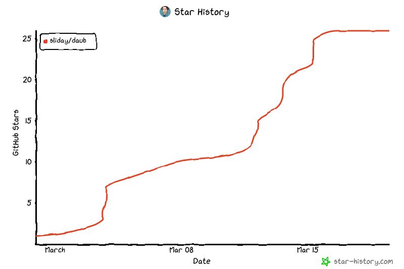](https://www.star-history.com/?repos=sliday%2Fdaub&type=date&legend=top-left)
## License
MIT
---
Made with consideration by [Sliday](https://github.com/sliday).