| name | iblai-vibe-profile |
| description | Add profile dropdown and settings page to your Next.js app |
| globs | null |
| alwaysApply | false |
/iblai-vibe-profile
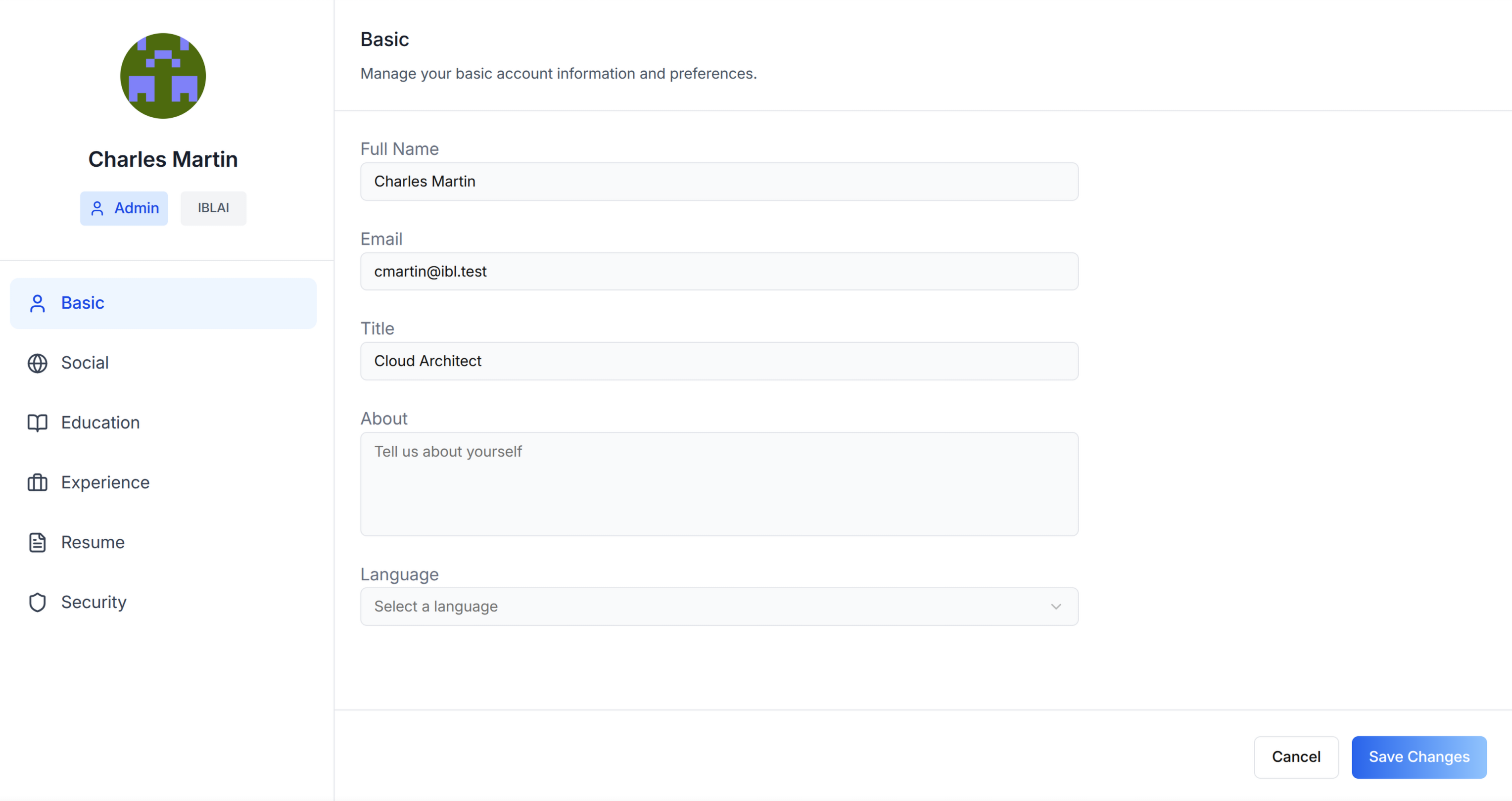
Add user profile features -- a compact avatar dropdown for your navbar and
a full settings page with tabs for Basic info, Social links, Education,
Experience, Resume, and Security.
Template: the dropdown this skill creates is bundled as
assets/profile-dropdown.tsx.j2. See
/iblai-vibe-scaffold for the {{ }} contract.
Do NOT add custom styles, colors, or CSS overrides to ibl.ai SDK components.
They ship with their own styling. Keep the components as-is.
Do NOT implement dark mode unless the user explicitly asks for it.
When building custom UI around SDK components, use the ibl.ai brand:
- Primary:
#0058cc, Gradient: linear-gradient(135deg, #00b0ef, #0058cc)
- Button:
bg-gradient-to-r from-[#2563EB] to-[#93C5FD] text-white
- Font: System sans-serif stack, Style: shadcn/ui new-york variant
- Follow the component hierarchy: use ibl.ai SDK components
(
@iblai/iblai-js) first, then shadcn/ui for everything else
(npx shadcn@latest add <component>). Do NOT write custom components
when an ibl.ai or shadcn equivalent exists. Both share the same
Tailwind theme and render in ibl.ai brand colors automatically.
- Follow BRAND.md for
colors, typography, spacing, and component styles.
You MUST run /iblai-vibe-ops-test before telling the user the work is ready.
After all work is complete, start a dev server (pnpm dev) so the user
can see the result at http://localhost:3000.
iblai.env is NOT a .env.local replacement — it only holds the 3
shorthand variables (DOMAIN, PLATFORM, TOKEN). Next.js still reads
its runtime env vars from .env.local.
Use pnpm as the default package manager. Fall back to npm if pnpm
is not installed. The generated app should live in the current directory,
not in a subdirectory.
When building a navbar or header, do NOT display the tenant/platform name.
Use the ibl.ai logo instead.
Navbar: If the user wants a navbar with the profile dropdown, guide
them to /iblai-vibe-navbar first. That skill creates the full navbar with
logo, page links, notification bell, and profile dropdown.
Common setup (brand, conventions, env files, verification): see docs/skill-setup.md.
Step 0: Start from vibe-starter? (new projects)
Before running this skill, ask the user:
Are you starting a new project from scratch? vibe-starter
(https://github.com/iblai/vibe-starter/tree/spa) already ships the profile
dropdown and /profile page wired up, alongside auth, navbar, and
account/notifications. Want to use that instead?
If yes, clone into a temp directory and copy into the current directory before
installing (running pnpm install inside the cloned subdirectory causes hardlink
issues), then skip this skill:
git clone -b spa https://github.com/iblai/vibe-starter.git vibe-starter-init
cp -a vibe-starter-init/. . && rm -rf vibe-starter-init
pnpm install --ignore-scripts
Run with --ignore-scripts to skip package lifecycle (postinstall) scripts.
If they prefer to add the profile features to an existing app, continue below.
Prerequisites
- Auth must be set up first (
/iblai-vibe-auth)
- MCP server + skills configured (
@iblai/mcp in .mcp.json)
Step 1: Check Environment
Before proceeding, check for a iblai.env
in the project root. Look for PLATFORM, DOMAIN, and TOKEN variables.
If the file does not exist or is missing these variables, tell the user:
"You need an iblai.env with your platform configuration. Download the
template and fill in your values:
curl -o iblai.env https://raw.githubusercontent.com/iblai/vibe/refs/heads/main/iblai.env"
Step 2: Create the Dropdown
Render assets/profile-dropdown.tsx.j2
into components/iblai/profile-dropdown.tsx (substitute {{ }} placeholders).
Files created
| File | Purpose |
|---|
components/iblai/profile-dropdown.tsx | Avatar dropdown for the navbar: profile, tenant switcher (admins only), and logout |
The dropdown reads userData, current_tenant, and tenants from
localStorage. Admin status is derived from the tenants array by matching
the current tenant key against is_admin. The avatar is fetched internally
by the SDK from the user metadata, keyed on username (use user_nicename)
— with a Gravatar fallback (enableGravatarOnProfilePic) and then initials.
The dropdown shows: Profile (opens the SDK profile modal), a
Tenant Switcher (admins only — see Step 4), and Logout. The
dedicated "Account" item is off (showAccountTab={false}); account settings
live on the separate /account page.
Step 3: Add a Full Profile Page
Step 2 creates the dropdown only. You must create the profile page
manually using the Profile component (not UserProfileModal, which renders
as a dialog).
Import Profile from @iblai/iblai-js/web-containers (the framework-agnostic
bundle, NOT the /next bundle). This renders an inline, full-page profile
editor with sidebar navigation on desktop and tabbed navigation on mobile.
Reference implementation
"use client";
import { useEffect, useState } from "react";
import { Profile } from "@iblai/iblai-js/web-containers";
import { resolveAppTenant } from "@/lib/iblai/tenant";
export default function ProfilePage() {
const [tenantKey, setTenantKey] = useState("");
const [username, setUsername] = useState("");
const [isAdmin, setIsAdmin] = useState(false);
const [ready, setReady] = useState(false);
useEffect(() => {
try {
const raw = localStorage.getItem("userData");
if (raw) {
const parsed = JSON.parse(raw);
setUsername(parsed.user_nicename ?? parsed.username ?? "");
}
} catch {}
const resolved = resolveAppTenant();
setTenantKey(resolved);
try {
const tenantsRaw = localStorage.getItem("tenants");
if (tenantsRaw) {
const parsed = JSON.parse(tenantsRaw);
const match = parsed.find((t: any) => t.key === resolved);
if (match) setIsAdmin(!!match.is_admin);
}
} catch {}
setReady(true);
}, []);
if (!ready || !tenantKey) {
return (
<div className="flex flex-1 items-center justify-center">
<p className="text-sm text-gray-400">Loading profile...</p>
</div>
);
}
return (
<div className="mx-auto w-full flex-1 overflow-auto px-4 py-8 md:w-[75vw] md:px-0">
<div className="rounded-lg border border-[var(--border-color)] bg-white overflow-hidden">
<Profile
tenant={tenantKey}
username={username}
isAdmin={isAdmin}
onClose={() => {}}
customization={{
showPlatformName: true,
useGravatarPicFallback: true,
}}
targetTab="basic"
/>
</div>
</div>
);
}
Key patterns
- White container wrapper: The SDK Profile component has no outer background.
Wrap it in a
bg-white rounded-lg border container so it renders as a card
against the gray page background (--sidebar-bg: #fafbfc).
Profile vs UserProfileModal: Profile renders inline (full page).
UserProfileModal renders as a dialog overlay. Use Profile for a
dedicated /profile route.- Import path:
@iblai/iblai-js/web-containers (NOT /next).
Step 4: Tenant Switcher
The template already wires the tenant switcher to match the reference app —
it's shown to admins only (showTenantSwitcher={isAdmin}) and fed by two
localStorage reads:
userTenants (from tenants) — populates the switch list. Without it
the switcher never appears, even when showTenantSwitcher is true.currentTenant (from current_tenant) — the FULL active-tenant object.
The SDK uses it to label the current tenant; without it the switcher falls
back to a generic label.
Why admins only: for a non-admin the SDK renders just the current tenant
name with no working switch list — a dead row. The reference app hides it
for non-admins; the template does the same. To show it to everyone, set
showTenantSwitcher to a constant true (or userTenants.length > 1).
The main tenant displays as "Community". That's the SDK's built-in
name for the main org — it is NOT read from current_tenant.platform_name,
and passing currentTenant does not change it. It's not a bug; other
tenants show their own name.
Step 5: Use MCP Tools for Customization
get_component_info("UserProfileDropdown")
get_component_info("Profile")
get_component_info("MediaBox")
get_component_info("ResumeTab")
Profile Content API
The SDK Profile component handles all API calls internally. If you need
to build custom profile UIs or interact with profile data programmatically,
here are the APIs each tab uses.
Read before write. When calling these REST endpoints directly (e.g.
via fetch or curl), always GET the current data first, merge your
changes into it, then POST/PUT the full object back. Most endpoints
replace the entire resource -- they do NOT merge fields. Skipping the
read will silently erase fields you didn't include in the payload.
curl -s "{dmUrl}/api/career/orgs/{org}/education/users/alice/" \
-H "Authorization: Token {dm_token}" > education.json
curl -X PUT "{dmUrl}/api/career/orgs/{org}/education/users/alice/?id={education_id}" \
-H "Authorization: Token {dm_token}" \
-H "Content-Type: application/json" \
-d @education.json
This applies to all profile endpoints: education, experience, and resume.
Service
Profile data lives in the DM (data manager) service:
| Service | Base URL | Auth Header | Manages |
|---|
| DM | config.dmUrl() | Authorization: Token {dm_token} | Education, experience, companies, institutions, resume |
Basic, Social, and Profile Image
Basic info (name, email, title, bio, language), social links, profile
image, and password reset are user-scope and not exposed via the
platform Api-Token. Use the SDK Profile component, which handles
these via the user's session — no direct REST endpoints are documented
here.
Education Tab
CRUD operations for education entries. Uses the DM career API.
GET    {dmUrl}/api/career/orgs/{org}/education/users/{username}/
POST   {dmUrl}/api/career/orgs/{org}/education/users/{username}/
PUT    {dmUrl}/api/career/orgs/{org}/education/users/{username}/?id={education_id}
DELETE {dmUrl}/api/career/orgs/{org}/education/users/{username}/?id={education_id}
Education schema:
{
id: number;
institution: { id: number; name: string };
institution_id: number;
degree: string;
field_of_study: string;
start_date: string;
end_date: string | null;
is_current: boolean;
grade: string;
activities: string;
description: string;
data: Record<string, any>;
metadata: Record<string, any>;
}
Institutions (lookup for the institution picker):
GET  {dmUrl}/api/career/orgs/{org}/institutions/users/{username}/
POST {dmUrl}/api/career/orgs/{org}/institutions/users/{username}/
Institution create payload:
{ name: string; institution_type: InstitutionTypeEnum; established_year?: number }
Experience Tab
CRUD operations for professional experience entries.
GET    {dmUrl}/api/career/orgs/{org}/experience/users/{username}/
POST   {dmUrl}/api/career/orgs/{org}/experience/users/{username}/
PUT    {dmUrl}/api/career/orgs/{org}/experience/users/{username}/?id={experience_id}
DELETE {dmUrl}/api/career/orgs/{org}/experience/users/{username}/?id={experience_id}
Experience schema:
{
id: number;
company: { id: number; name: string };
company_id: number;
title: string;
employment_type: string;
location: string;
start_date: string;
end_date: string | null;
is_current: boolean;
description: string;
data: Record<string, any>;
metadata: Record<string, any>;
}
Companies (lookup for the company picker):
GET  {dmUrl}/api/career/orgs/{org}/companies/users/{username}/
POST {dmUrl}/api/career/orgs/{org}/companies/users/{username}/
Company create payload:
{ name: string; industry?: string; website?: string; logo_url?: string }
Resume Tab
Upload and view PDF resumes.
GET  {dmUrl}/api/career/resume/orgs/{org}/users/{username}/
POST {dmUrl}/api/career/resume/orgs/{org}/users/{username}/
PUT  {dmUrl}/api/career/resume/orgs/{org}/users/{username}/
Upload (FormData):
user: {username}
platform: {org}
resume: File          // PDF only, max 25MB -- marks as CV
additional_files: File  // general file upload (not CV)
Response:
{
  id: number;
  user: number;
  platform: string;
  files: [{ name: string; url: string; type: string }];
  links: [{ url: string }];
}
Security Tab
Account deletion.
POST {dmUrl}/api/core/users/delete/ // account deletion (self-retire)
Account deletion payload: { username: string }. Password reset is
user-scope and runs through the SDK / Auth SPA, not via the platform
Api-Token.
RTK Query Hooks (SDK Exports)
The SDK's data-layer exports these hooks for all career operations:
import {
  useGetUserEducationQuery,
  useCreateUserEducationMutation,
  useUpdateUserEducationMutation,
  useDeleteUserEducationMutation,
  useGetUserExperienceQuery,
  useCreateUserExperienceMutation,
  useUpdateUserExperienceMutation,
  useDeleteUserExperienceMutation,
  useGetUserInstitutionsQuery,
  useCreateUserInstitutionMutation,
  useGetUserCompaniesQuery,
  useCreateUserCompanyMutation,
  useGetUserResumeQuery,
  useCreateUserResumeMutation,
} from "@iblai/iblai-js/data-layer";
For user metadata (basic/social):
import {
  useGetUserMetadataQuery,
  useUpdateUserMetadataMutation,
  useUploadProfileImageMutation,
  useGetUserMetadataEdxQuery,
  useResetPasswordMutation,
} from "@iblai/iblai-js/data-layer";
Building a Custom Career API Slice
If you need career APIs without the SDK's built-in hooks, build a standard
RTK Query slice with fetchBaseQuery and one endpoint per row in the
endpoint tables above. Use Authorization: Token {dm_token} (from
localStorage), and tag invalidation on ["education", "experience", "institution", "company", "resume"].
User Metadata API
The ibl.ai platform provides per-user metadata storage via the Agent
Metadata endpoint. This is useful for storing arbitrary JSON data scoped
to a specific user and agent (e.g. application progress, preferences,
onboarding state).
Endpoints
GET  {dmUrl}/api/ai/mentor/orgs/{org}/users/{username}/metadata?mentor={mentorId}
POST {dmUrl}/api/ai/mentor/orgs/{org}/metadata/        body: { mentor_id, metadata }
- Auth:
Authorization: Token {axd_token} (from localStorage)
- Scope: Per-user, per-agent; isolated.
- Schema: Arbitrary JSON.
- Merge behavior: POST merges new keys with existing metadata
(does not replace the entire object).
AI Profile Memory API
The platform stores AI-learned facts about a user as tag/detail pairs.
This powers the "AI Memory" tab in the profile modal.
GET    {dmUrl}/api/ai-mentor/orgs/{org}/users/{user_id}/ai-user-profile-memory/
POST   {dmUrl}/api/ai-mentor/orgs/{org}/users/{user_id}/ai-user-profile-memory/
DELETE {dmUrl}/api/ai-mentor/orgs/{org}/users/{user_id}/ai-user-profile-memory/{tag}/
Create/Read:
{ tag: "favorite-animal", detail: "my favorite animal is cat" }
[{ tag: "favorite-animal", detail: "my favorite animal is cat" }]
Auth: Uses axd_token from localStorage.
Chat Privacy Settings
Users can control how their chat data is stored.
GET  {dmUrl}/api/ai-account/orgs/{org}/users/{user_id}/chat-privacy-config/
GET  {dmUrl}/api/ai-account/orgs/{org}/users/{user_id}/chat-privacy-settings/
POST {dmUrl}/api/ai-account/orgs/{org}/users/{user_id}/chat-privacy-settings/
Privacy modes: normal, anonymized, disabled
The config endpoint returns whether the platform has this feature enabled.
The settings endpoint reads/writes the user's preference.
Media Upload (MediaBox)
The SDK provides a MediaBox component for file and link uploads. It renders
a tabbed interface with a file upload zone and a link input field, plus a
list of previously uploaded files/links.
Import
import { MediaBox, type UploadedFile } from "@iblai/iblai-js/web-containers/next";
Props
| Prop | Type | Description |
|---|
uploadedMedia | UploadedFile[] | Previously uploaded files/links to display |
isLoading | boolean? | Show loading state |
isError | boolean? | Show error state |
isUploading | boolean? | Show upload-in-progress state |
resumeCheckboxEnabled | boolean? | Show "This is my CV" checkbox |
onUploadFile | (file: File, isResume: boolean) => void | Called when a file is selected |
onUploadLink | (url: string) => void | Called when a link is submitted |
onError | (message: string) => void | Called on validation errors |
UploadedFile type
interface UploadedFile {
name: string;
url: string;
type?: string;
}
Peer dependency
MediaBox requires @tanstack/react-form:
pnpm add @tanstack/react-form
Backend: Career/Resume API
MediaBox is a presentational component -- it does not handle uploads itself.
You must connect it to the Career/Resume API for persistent storage:
GET/PUT/POST /api/career/resume/orgs/{org}/users/{username}/
Connecting MediaBox to the Career API
import { useMemo } from "react";
import { toast } from "sonner";
import { MediaBox, type UploadedFile } from "@iblai/iblai-js/web-containers/next";
import { useGetUserResumeQuery, useCreateUserResumeMutation } from "@/services/career-api";
import { resolveAppTenant } from "@/lib/iblai/tenant";

function getUserName(): string {
  if (typeof window === "undefined") return "";
  try {
    const raw = localStorage.getItem("userData");
    return raw ? JSON.parse(raw).user_nicename ?? "" : "";
  } catch { return ""; }
}

export function DocumentUploads() {
  const org = useMemo(() => resolveAppTenant(), []);
  const username = useMemo(() => getUserName(), []);

  const { data, isLoading, isError, refetch } = useGetUserResumeQuery(
    { org, username },
    { skip: !org || !username }
  );
  const [createResume, { isLoading: isUploading }] = useCreateUserResumeMutation();

  const uploadedMedia: UploadedFile[] = useMemo(() => {
    if (!data) return [];
    const files = (data.files ?? []).map((f) => ({ name: f.name, url: f.url, type: f.type }));
    const links = (data.links ?? []).map((l) => ({ name: l.url, url: l.url, type: "link" }));
    return [...files, ...links];
  }, [data]);

  async function handleUploadFile(file: File, isResume: boolean) {
    const formData = new FormData();
    formData.append("user", username);
    formData.append("platform", org);
    formData.append(isResume ? "resume" : "additional_files", file);
    try {
      await createResume({ org, username, resume: formData, method: "POST" }).unwrap();
      toast.success("File uploaded successfully");
      refetch();
    } catch { toast.error("Failed to upload file"); }
  }

  async function handleUploadLink(url: string) {
    const formData = new FormData();
    formData.append("user", username);
    formData.append("platform", org);
    const existingLinks = data?.links ?? [];
    existingLinks.forEach((link, index) => {
      formData.append(`link_${existingLinks.length + 1 - index}`, link.url);
    });
    formData.append("link_1", url);
    try {
      await createResume({ org, username, resume: formData }).unwrap();
      toast.success("Link added successfully");
      refetch();
    } catch { toast.error("Failed to add link"); }
  }

  if (!org || !username) {
    return <p className="text-[14px] text-[#86868b]">Please sign in to upload documents.</p>;
  }

  return (
    <MediaBox
      uploadedMedia={uploadedMedia}
      isLoading={isLoading}
      isError={isError}
      isUploading={isUploading}
      resumeCheckboxEnabled={true}
      onUploadFile={handleUploadFile}
      onUploadLink={handleUploadLink}
      onError={(msg) => toast.error(msg)}
    />
  );
}
Key details
- Auth: Uses
dm_token from localStorage (NOT axd_token)
- FormData fields:
user (username), platform (org key),
resume (file, marks as CV) or additional_files (file, general upload)
- Links: Append numbered
link_N fields. Preserve existing links when
adding a new one
- Persistent: Files are stored on the user's profile permanently
(unlike chat file uploads which are session-scoped)
Career Profile Tabs (Standalone)
The SDK also exports individual career profile tabs that can be used
outside the full Profile component:
ResumeTab
import { ResumeTab } from "@iblai/iblai-js/web-containers";
<ResumeTab org={tenantKey} username={username} />
Renders a resume upload and display interface. Props: org (string),
username (string).
EducationTab
import { EducationTab } from "@iblai/iblai-js/web-containers";
<EducationTab org={tenantKey} username={username} />
Renders education background management (add/edit/delete education entries).
Props: org (string), username (string).
ExperienceTab
import { ExperienceTab } from "@iblai/iblai-js/web-containers";
<ExperienceTab org={tenantKey} username={username} />
Renders professional experience management. Props: org (string),
username (string).
Dialogs
These companion dialogs can be used alongside the tabs:
| Component | Import | Description |
|---|
EducationDialog | @iblai/iblai-js/web-containers | Dialog for adding/editing education entries |
ExperienceDialog | @iblai/iblai-js/web-containers | Dialog for adding/editing experience entries |
CompanyDialog | @iblai/iblai-js/web-containers | Company selection dialog |
InstitutionDialog | @iblai/iblai-js/web-containers | Institution selection dialog |
<UserProfileDropdown> Props
The generated dropdown component. Import from @iblai/iblai-js/web-containers/next.
| Prop | Type | Description |
|---|
email | string | Required. User email (from userData.user_email); used for the Gravatar avatar fallback |
username | string | Username — use user_nicename (the avatar metadata fetch keys on it) |
mainPlatformKey | string | Required. Main/community tenant key (config.mainTenantKey()) |
tenantKey | string | Active tenant/org key |
currentTenant | Tenant? | Full active-tenant object (from current_tenant) — labels the tenant switcher |
userTenants | Tenant[] | Required for tenant switcher -- full tenant list from localStorage |
userIsAdmin | boolean | Shows admin badge + gates the tenant switcher |
userIsStudent | boolean? | Non-admin flag (!isAdmin) |
enableGravatarOnProfilePic | boolean? | Gravatar fallback when the user has no uploaded image (default true) |
showProfileTab | boolean | Show profile link |
showAccountTab | boolean | Show the dedicated "Account" item (keep false — account lives on /account) |
showTenantSwitcher | boolean | Show tenant switcher (needs userTenants + currentTenant); gate on userIsAdmin |
showLogoutButton | boolean | Show logout button |
showHelpLink | boolean | Show help link |
showLearnerModeSwitch | boolean? | Show learner/instructor mode toggle (admins) |
currentSPA | string? | Current app id (e.g. "mentor") — used for conditional SDK rendering |
currentPlatformBaseDomain | string? | Base domain for custom-domain settings (config.platformBaseDomain()) |
authURL | string | Auth service URL |
onLogout | () => void | Logout callback |
onTenantChange | (tenant: string) => void | Called when user switches tenant -- must set app_tenant in localStorage |
onTenantUpdate | (tenant: Tenant) => void | Called when tenant data updates -- must set app_tenant in localStorage |
className | string? | Additional CSS class |
dropdownClassName | string? | CSS class for dropdown panel |
avatarSize | number? | Avatar size in pixels |
metadata | { help_center_url?: string; show_help?: boolean } | Platform metadata for help link |
metadataLoaded | boolean? | Whether metadata has finished loading |
enableMemoryTab | boolean? | Show AI memory management tab |
enableCatalogInvite | boolean? | Enable catalog invite feature |
enableRbac | boolean? | Enable RBAC permission checks |
isModalOpen | boolean? | Control profile modal open state externally |
onModalOpenChange | (open: boolean) => void | Callback when modal open state changes |
defaultActiveTab | string? | Default tab when profile modal opens |
onAccountDeleted | () => void | Callback after account deletion |
<Profile> Props (Full-Page Profile)
Import from @iblai/iblai-js/web-containers.
| Prop | Type | Description |
|---|
tenant | string | Tenant/org key |
username | string | Username |
isAdmin | boolean | Admin flag |
onClose | () => void | Close callback |
customization | object | See below |
targetTab | string | Initial tab: basic, social, education, experience, resume, security |
enableMemoryTab | boolean? | Show AI memory management tab |
localLLMProps | object? | Props for local LLM tab (Tauri desktop only) |
onAccountDeleted | () => void | Callback after account deletion |
Customization object
{
showMentorAIDisplayCheckbox?: boolean;
showLeaderboardDisplayCheckbox?: boolean;
showUsernameField?: boolean;
showPlatformName?: boolean;
useGravatarPicFallback?: boolean;
}
<UserProfileModal> Props (Profile + Account Modal)
For a profile editing modal (used by the MentorAI reference app), import
UserProfileModal from @iblai/iblai-js/web-containers/next. This is a
dialog that combines profile editing and account settings in one overlay.
The modal shows Profile tabs (basic, social, education, experience,
resume, security) and Account tabs (organization, management,
integrations, billing). Billing/purchases is on the Account side, not
the Profile side.
Required
| Prop | Type | Description |
|---|
isOpen | boolean | Whether the modal is visible |
onClose | () => void | Close callback |
params | { tenantKey: string; mentorId?: string; isAdmin?: boolean } | Tenant key, optional agent ID and admin flag |
authURL | string | Auth service URL (from config.authUrl()) |
Optional
| Prop | Type | Description |
|---|
tenants | Tenant[] | Full list of user tenants from localStorage |
targetTab | string | Initial tab: basic, social, education, experience, resume, security, organization, management, integrations, billing |
showPlatformName | boolean | Show tenant name badge |
useGravatarPicFallback | boolean | Use Gravatar when no profile pic |
currentSPA | string | Current app identifier (e.g., "agent") |
currentPlatformBaseDomain | string | Base domain for custom domain settings |
billingEnabled | boolean | Enable billing tab (requires Stripe integration) |
billingURL | string | Stripe billing portal URL |
topUpEnabled | boolean | Enable credit top-up |
topUpURL | string | Stripe top-up URL |
onTenantUpdate | (tenant: Tenant) => void | Called when tenant is updated |
onBillingTabRequest | () => Promise<void> | void | Called when billing tab is opened -- fetch billing data |
onUpgradeClick | () => void | Called when upgrade button is clicked |
onAccountDeleted | () => void | Called after account deletion |
Step 6: Verify
Run /iblai-vibe-ops-test before telling the user the work is ready:
pnpm build -- must pass with zero errorspnpm test -- vitest must pass- Start dev server and touch test:
pnpm dev &
npx playwright screenshot http://localhost:3000/profile /tmp/profile.png
Important Notes
- Redux store: Must include
mentorReducer and mentorMiddleware
initializeDataLayer(): 5 args (v1.2+)@reduxjs/toolkit: Deduplicated via webpack aliases in next.config.ts- Admin detection: Derived from
tenants array in localStorage
- SDK hardcoded styles: The SDK Profile component uses
bg-white and
bg-gray-50 internally. Do NOT override these. Instead, wrap the component
in a white container so it renders correctly against the gray page background.
- Billing/Purchases: Lives on the Account page (
/iblai-vibe-account), not
on the Profile page. Use UserProfileModal with targetTab="billing" and
billingEnabled={true} to access it from the combined modal.
- Brand guidelines: BRAND.md
